
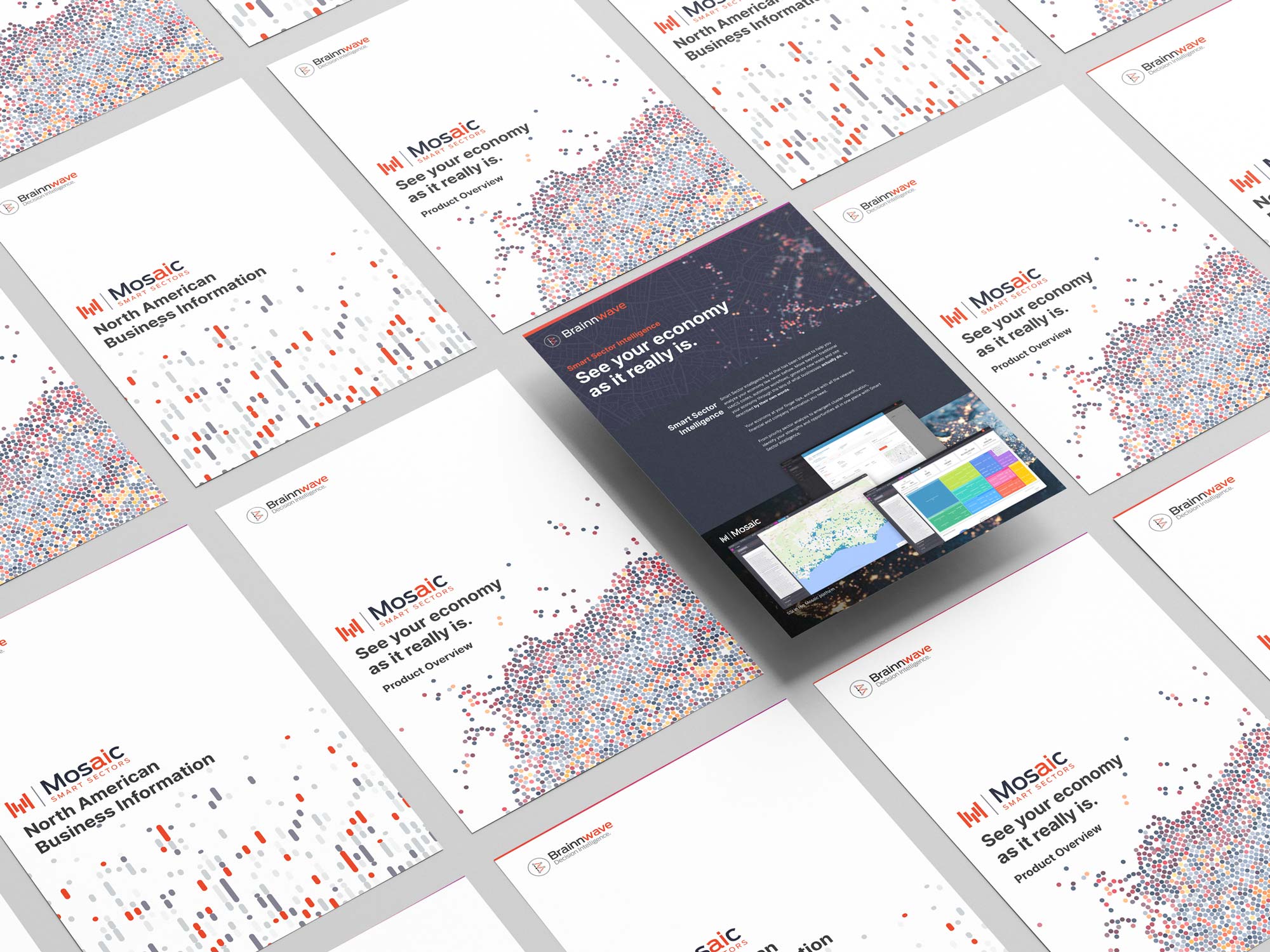
Mosaic was Brainnwave’s data platform.
It evolved from a Business Intelligence Platform (BIP) and a Market Intelligence Platform (MIP). It was called “The Brainnwave Platform”, it was even, for a short while, branded as “Ossian” but ultimately after years of direction changes and re-factoring we ended up at Mosaic.
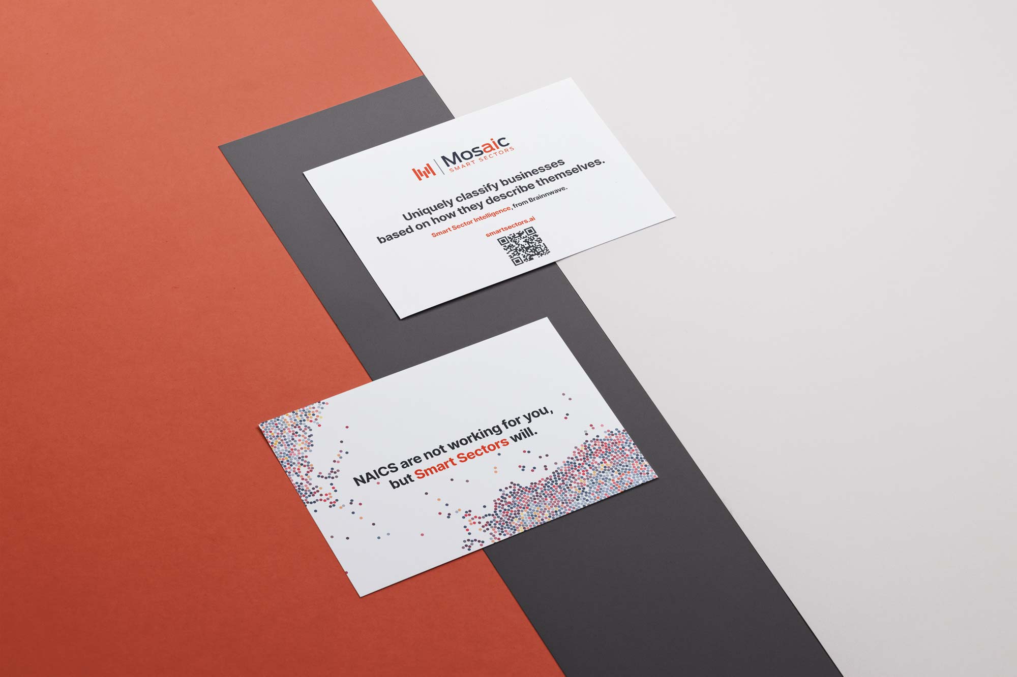
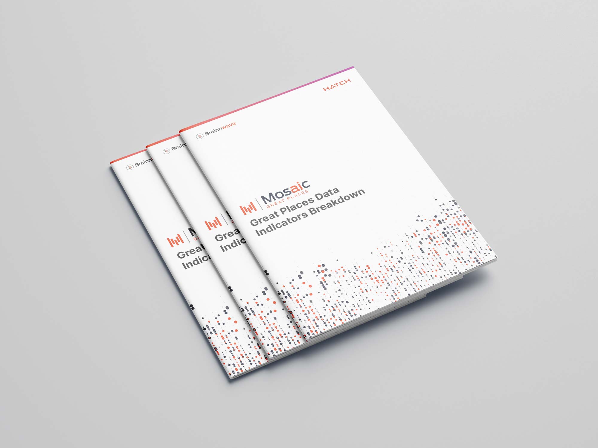
Mosaic was the underlying platform on which we built a couple of product featuresets — Smart Sector Intelligence (SSI) and Great Places.
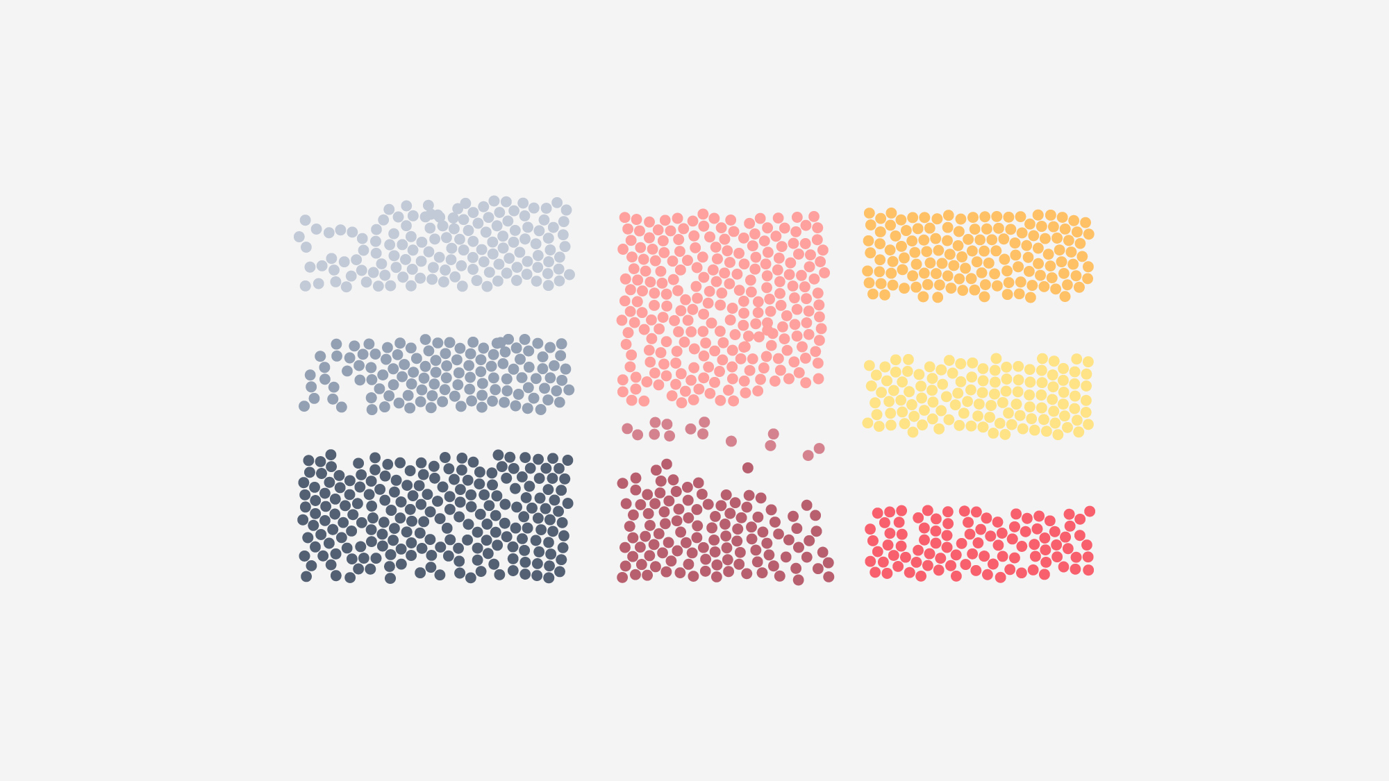
The marque I devised represented both data visualisation and traditional mosaic methods while forming an M shape to match the typeface from the Brainnwave font for consistency.
As with Brainnwave, the notion of “data” is a slippery one when thinking visually.
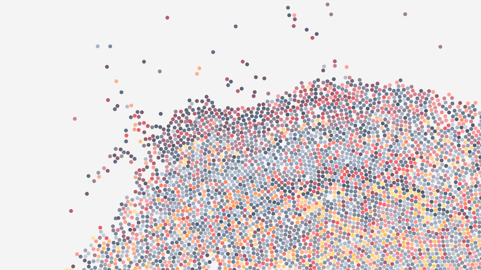
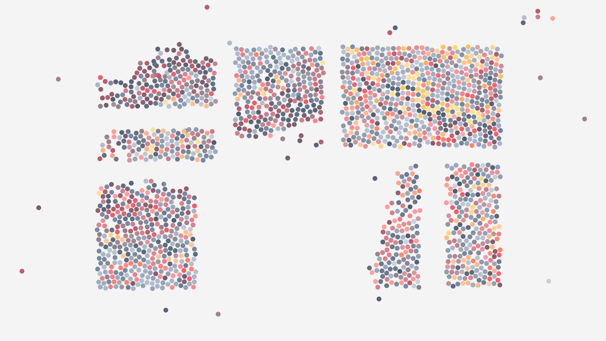
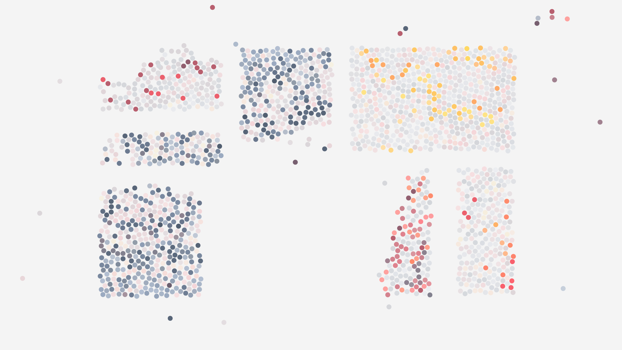
To distinguish the platform, provide visual interest and link to some of the visualisations that would be in the platform I opted for a dots and dashes approach.
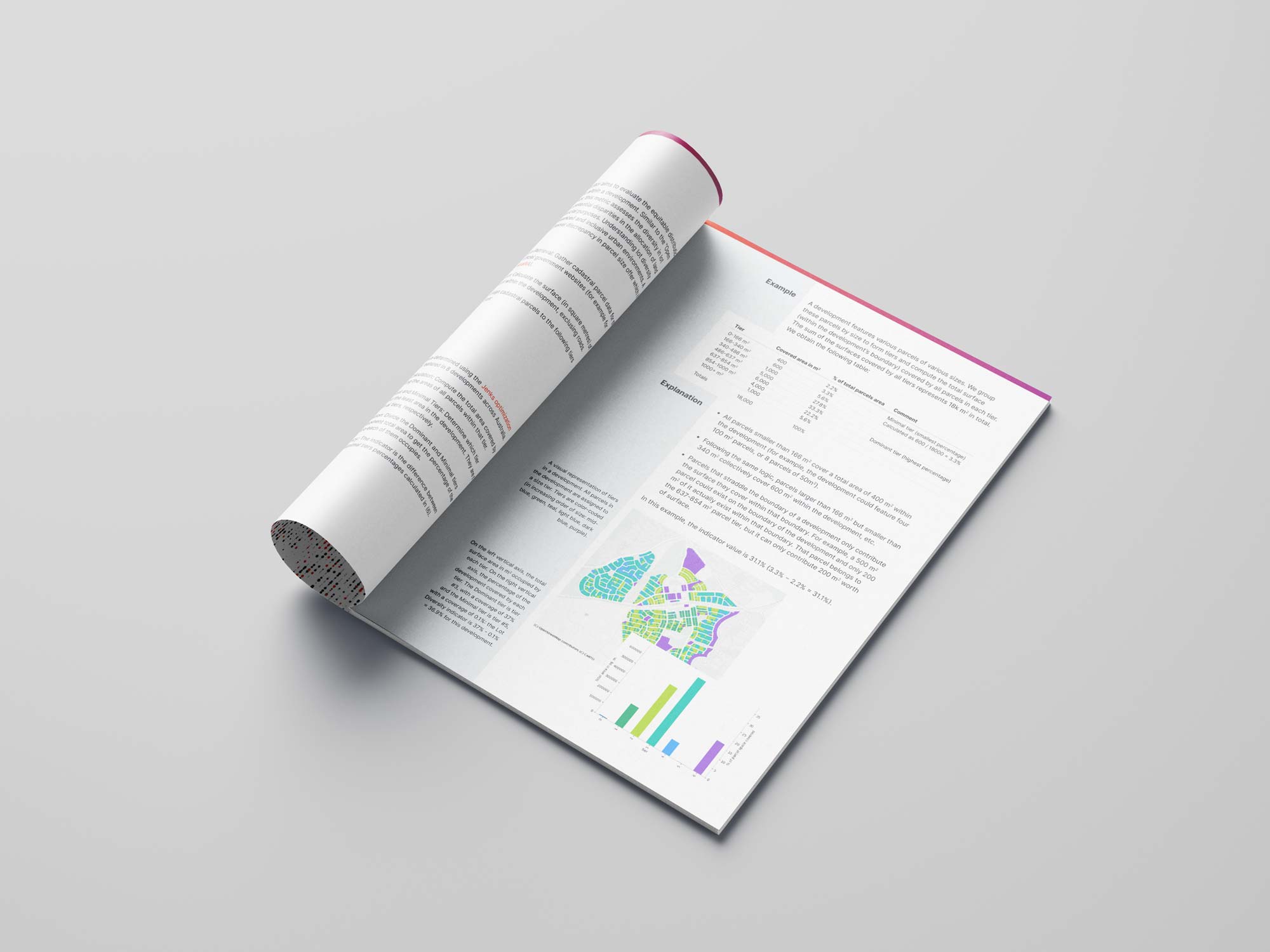
This helped represent the complexity and volume of data we worked with and when it came to explaining our SSI product, aided visual explanations.
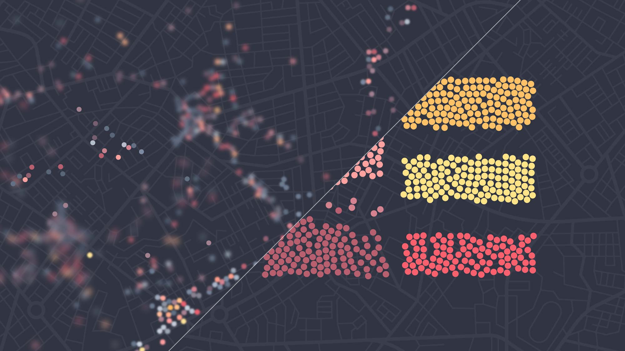
Of course, the brand identity had to follow down to the product seamlessly so consistency in things like colours, typefaces and graphics had to be retained.
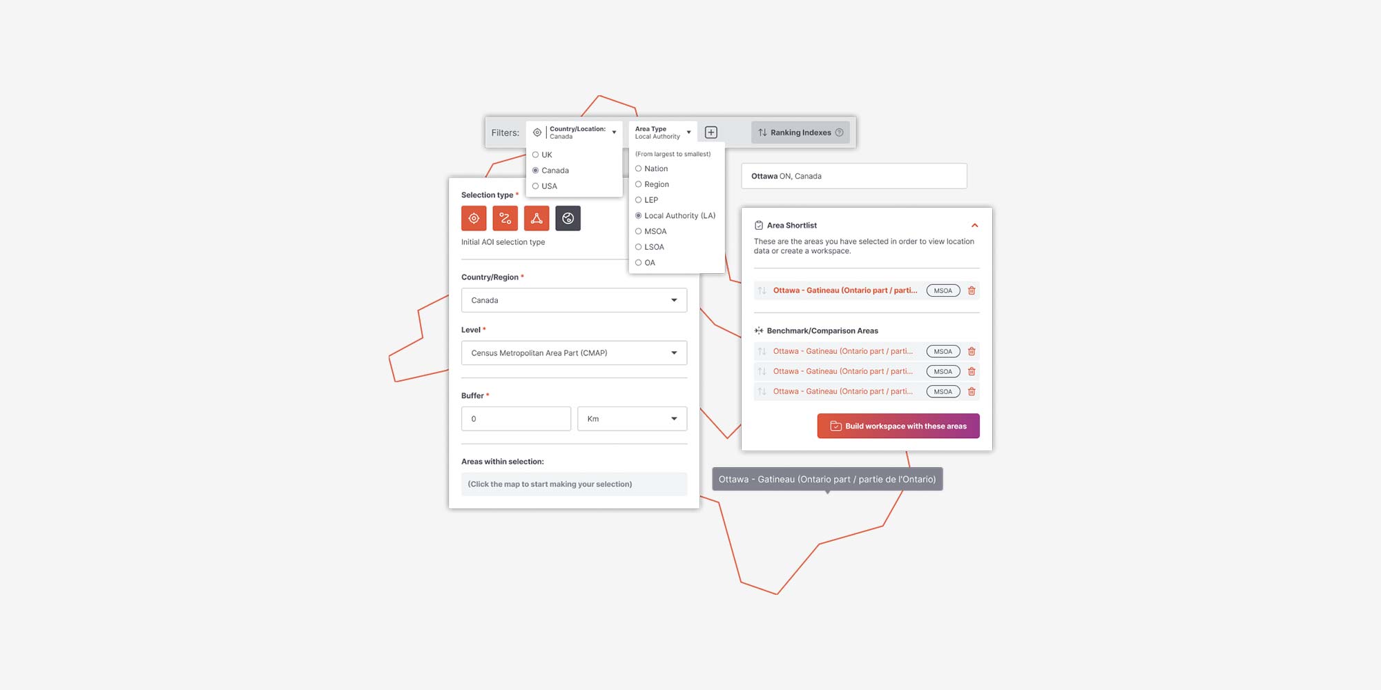
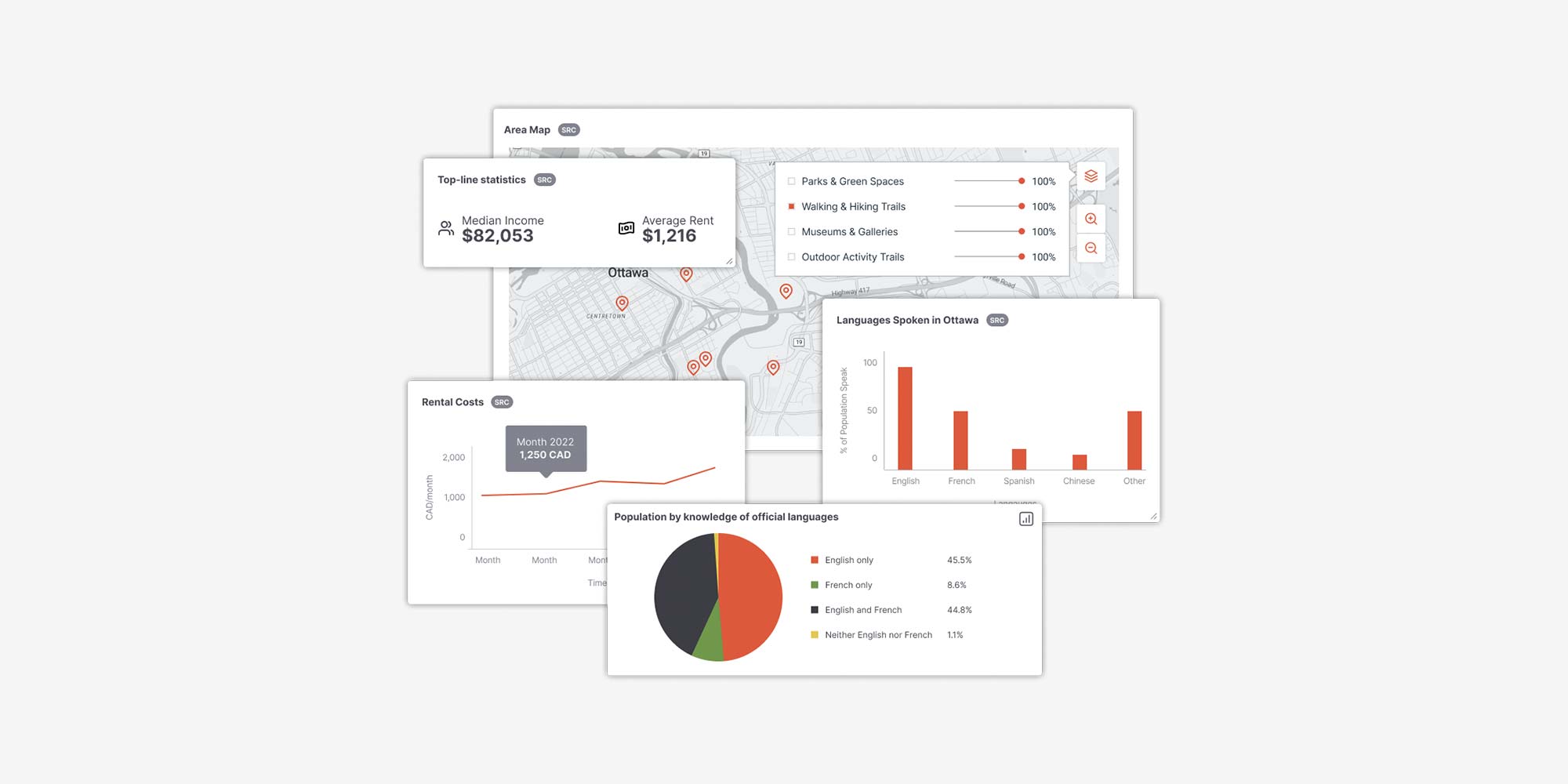
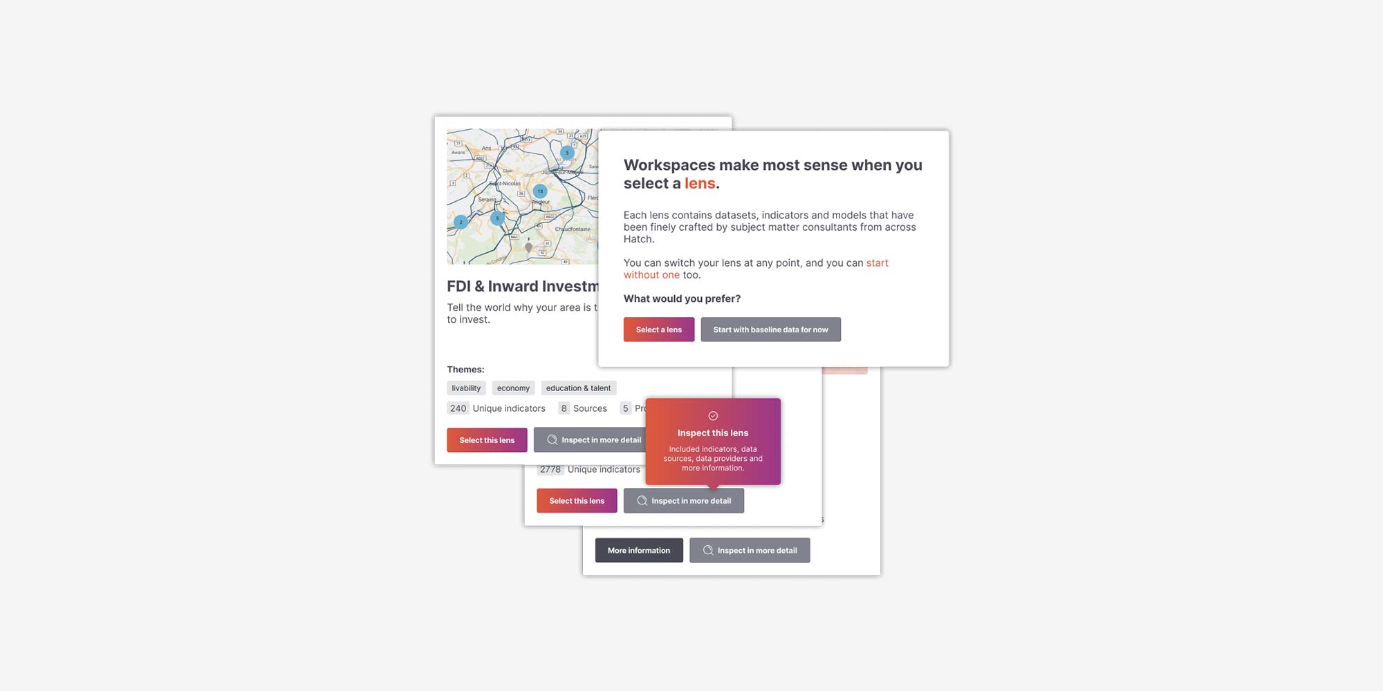
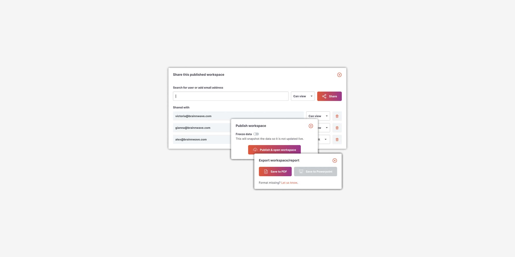
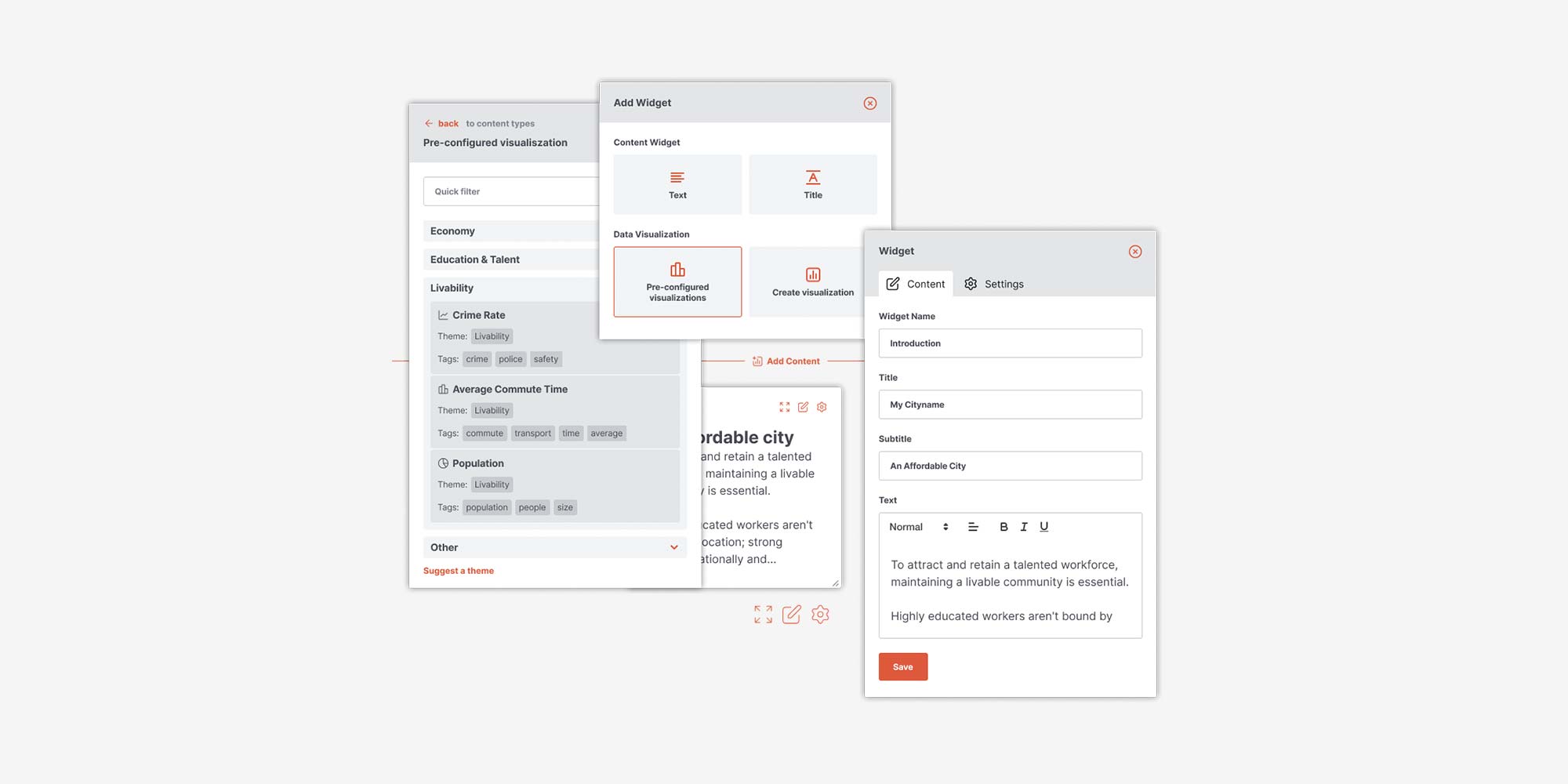
Although not “brand design” I was also tasked with the entire visual design of the platform, the design system and the product over multiple iterations in capacity as Head of Design and Creative Director at Brainnwave.

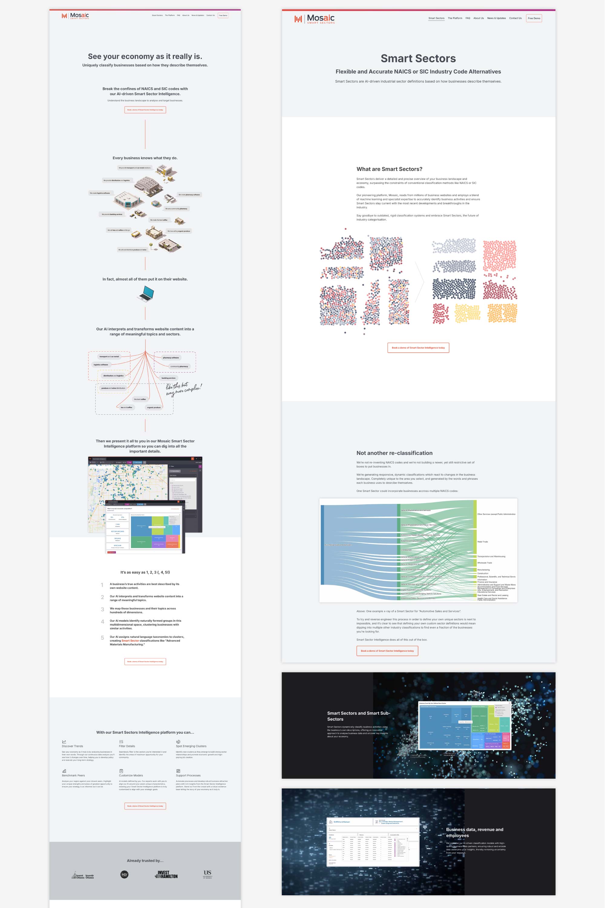
With a new product, concept and the complexity of the data science behind the scenes, we needed to explain this coherently on a website, while retaining the brand identity.
I designed, wrote and built the responsive website from scratch. I handled everything from copywriting and images to front-end development.
The work Alex has done in bringing the Mosaic brand (and product) to life is excellent. I had no idea when we conceptualised the product and gave it a name, that we’d see it grow into something with such a strong presence.
Clients and prospects regularly comment on how great it all looks and feels.