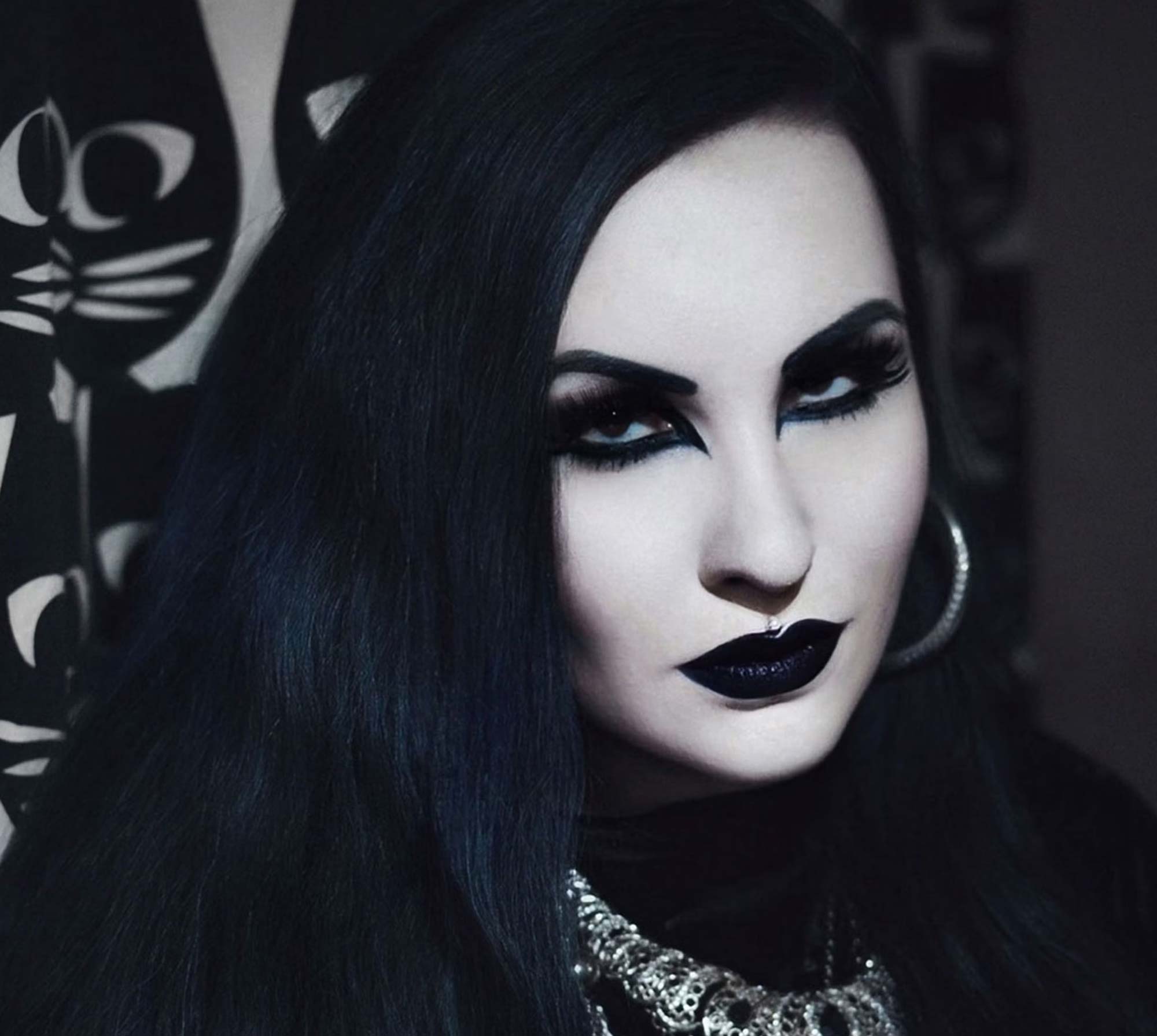
A well known music producer friend of mine is both a coffee lover and a goth. I often heard him refer to his coffee as “goth juice” and it got me thinking.
I was hunting for a new branding project and the name Goth Juice was rattling about in my head.
It occurred to me that there was probably a really strong (pun intended) coffee branding project to be explored here, and like all design jobs, my brain had started coming up with ideas before my pencil hit the paper.
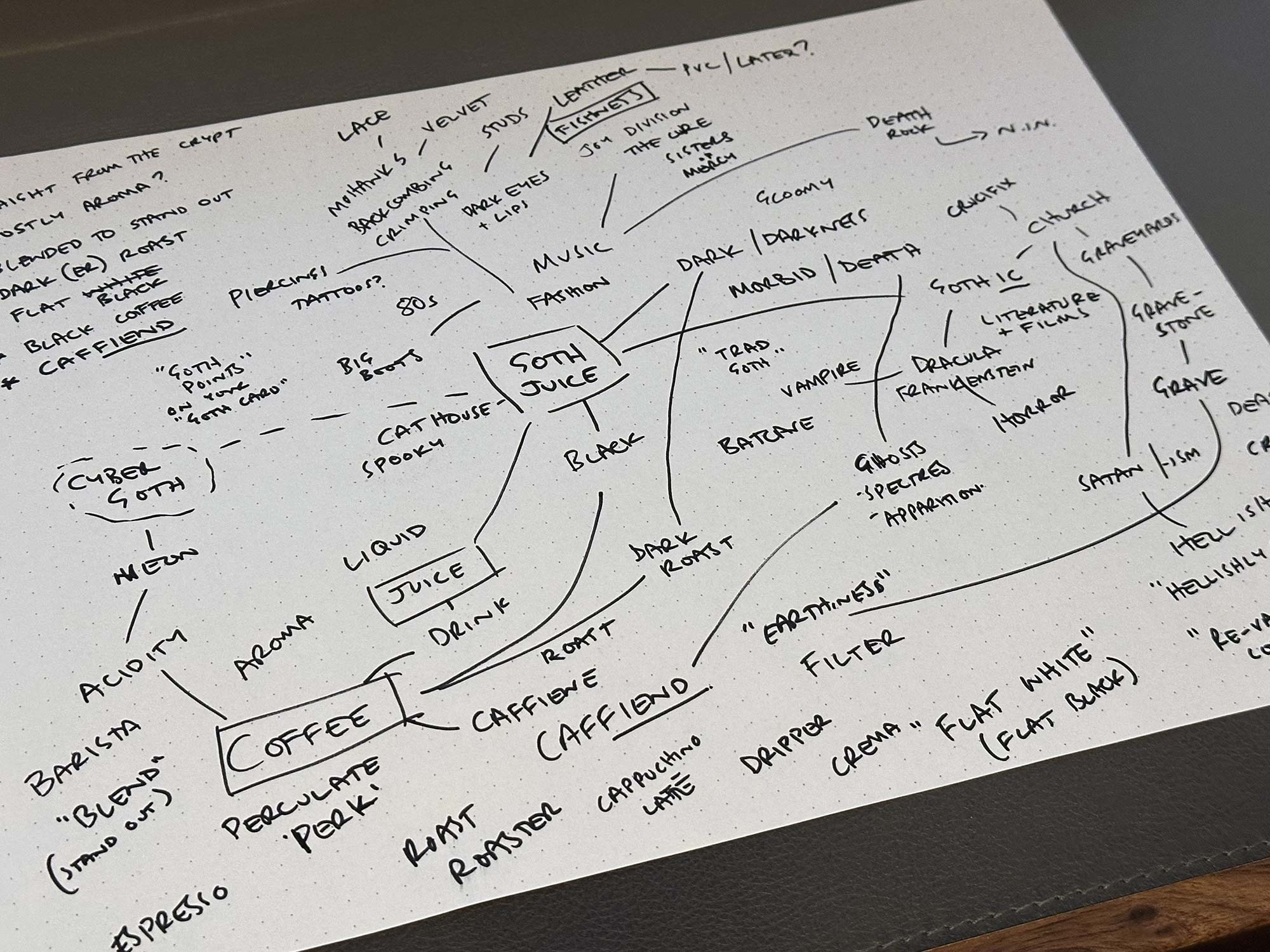
I did some diving into goth culture, it’s roots, the music that it grew from and all things associated with goths and coffee.
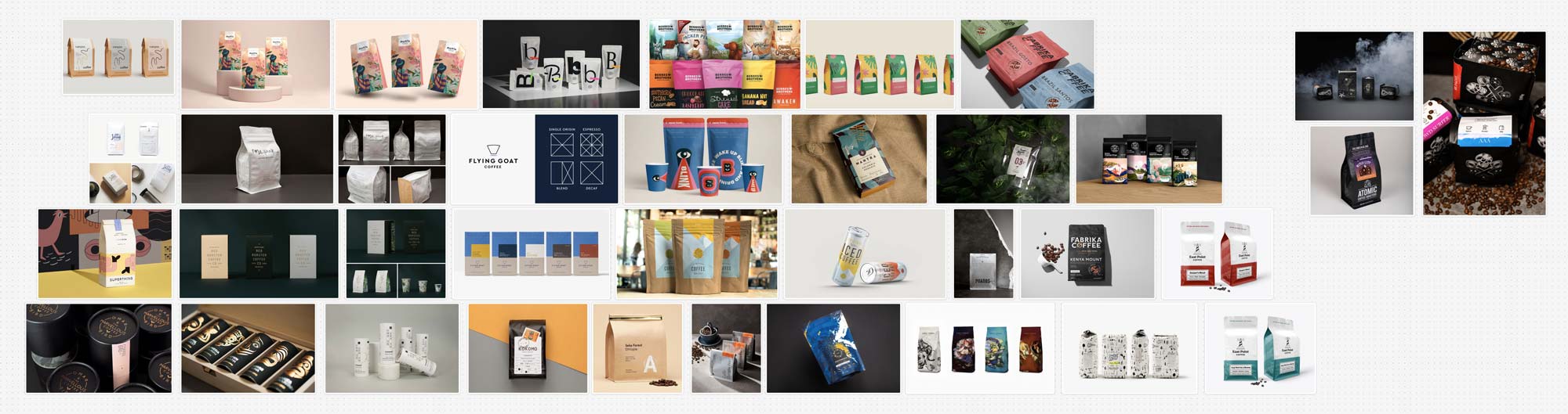
I also looked into coffee branding and packaging, and wow, there are some beautiful brands out there! None that go too far down the gothy route though, so seems there’s something of a visual gap at least.
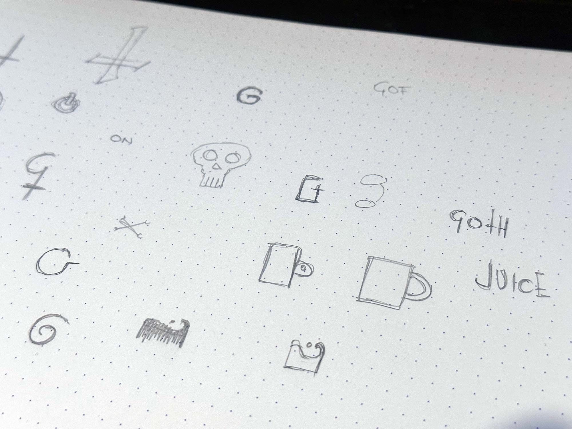
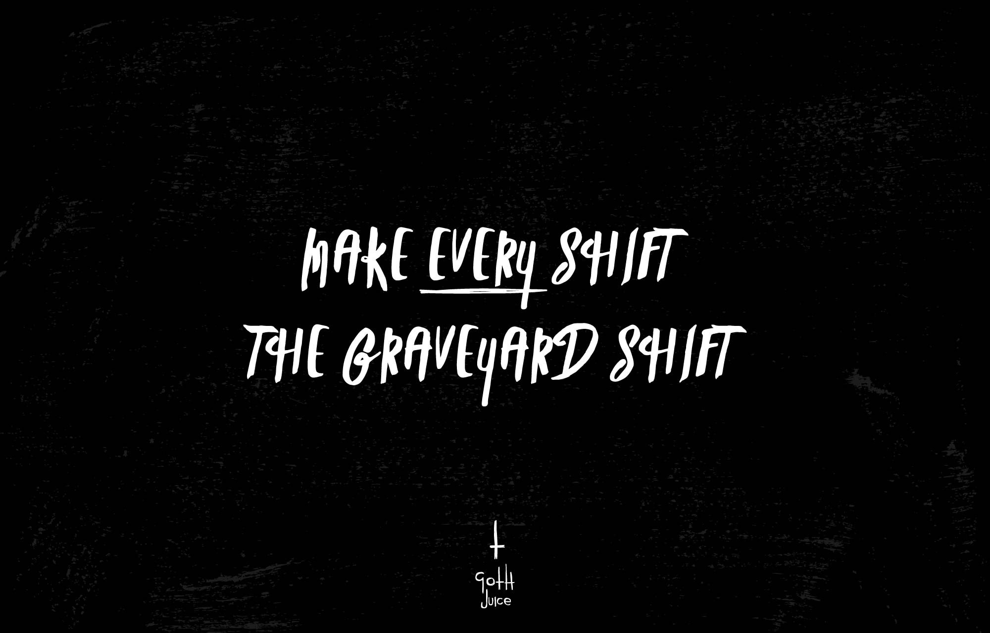
As my exploration developed, so too did the beginnings of some phrases and copy.
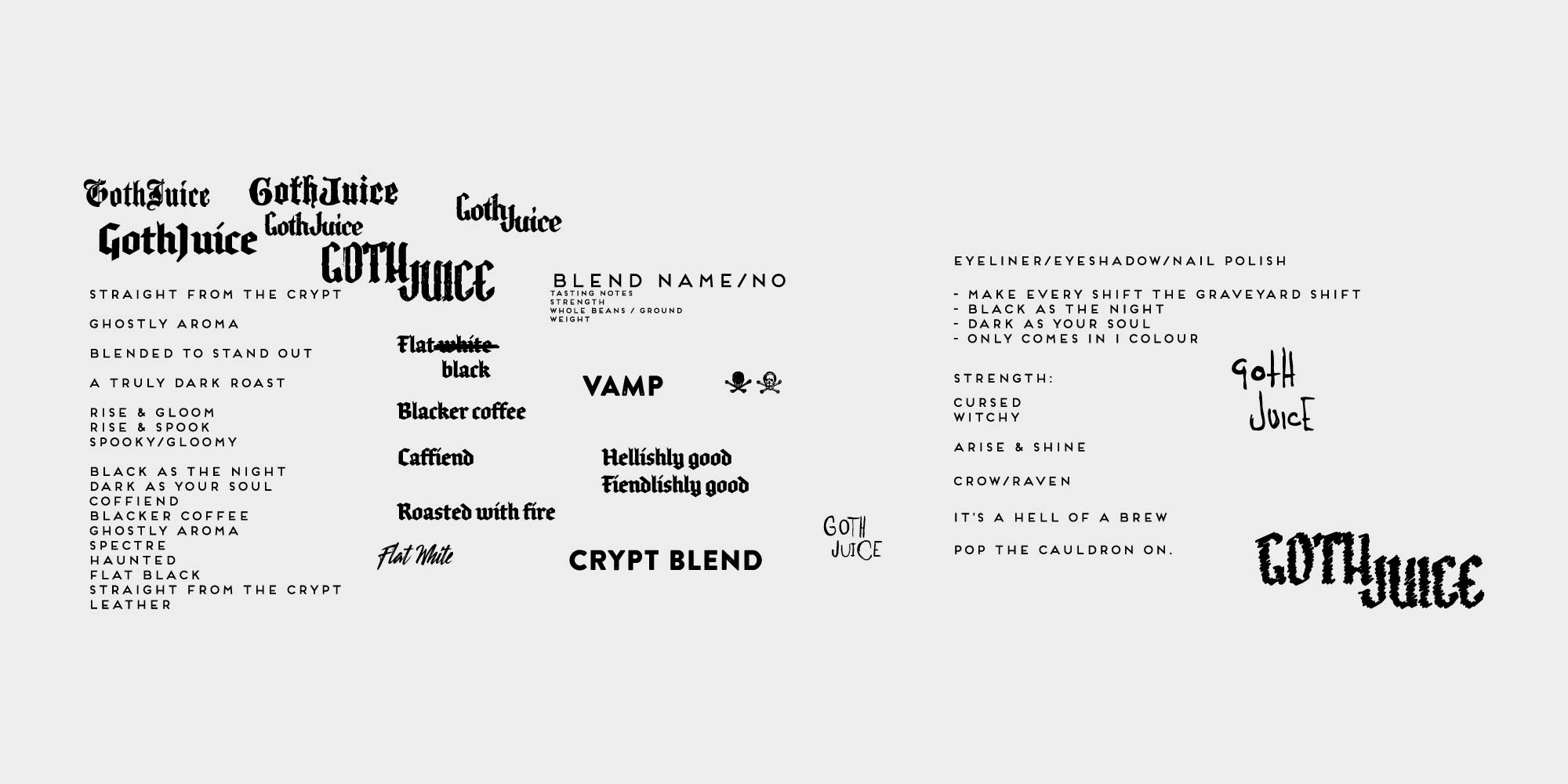
After reading about the way Lantern start to formulate messaging and positioning with a collection of statements and copy (in David Airey’s wonderful Identity Designed book) I felt like working these phrases up with a rough early logo would be a good way to start to feel for the brand.
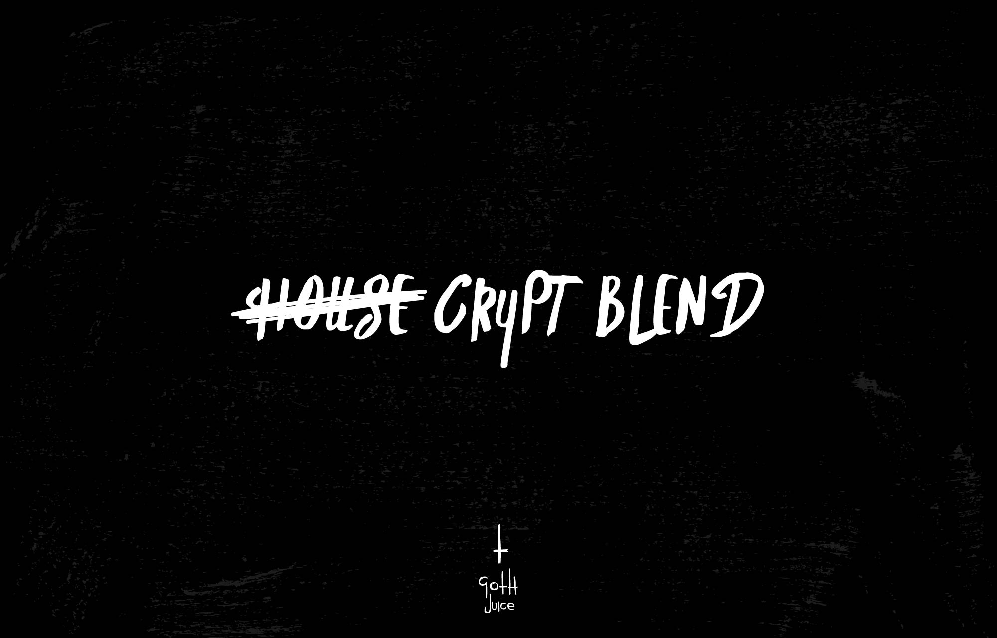
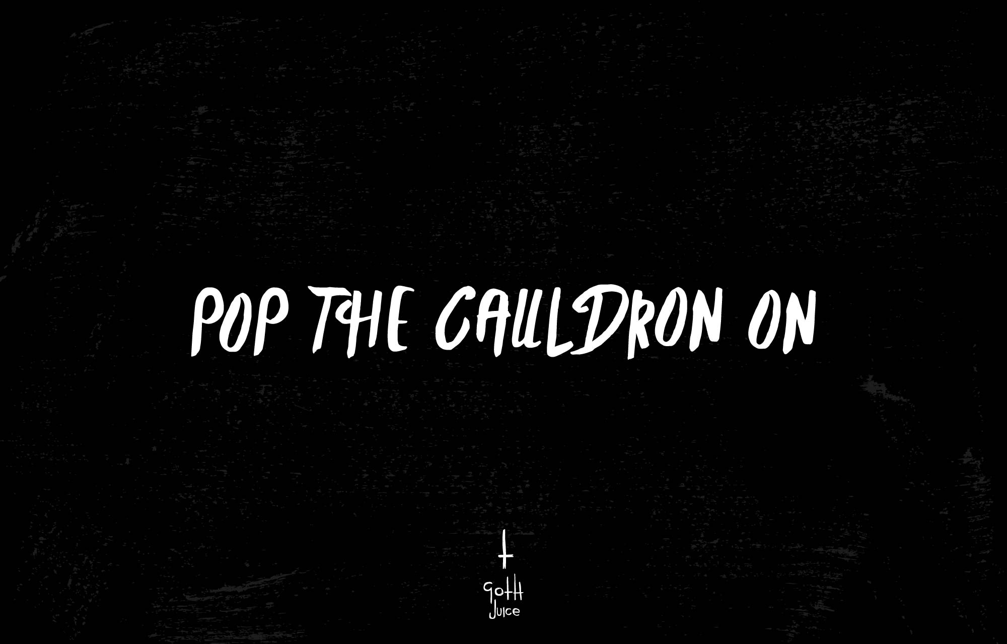
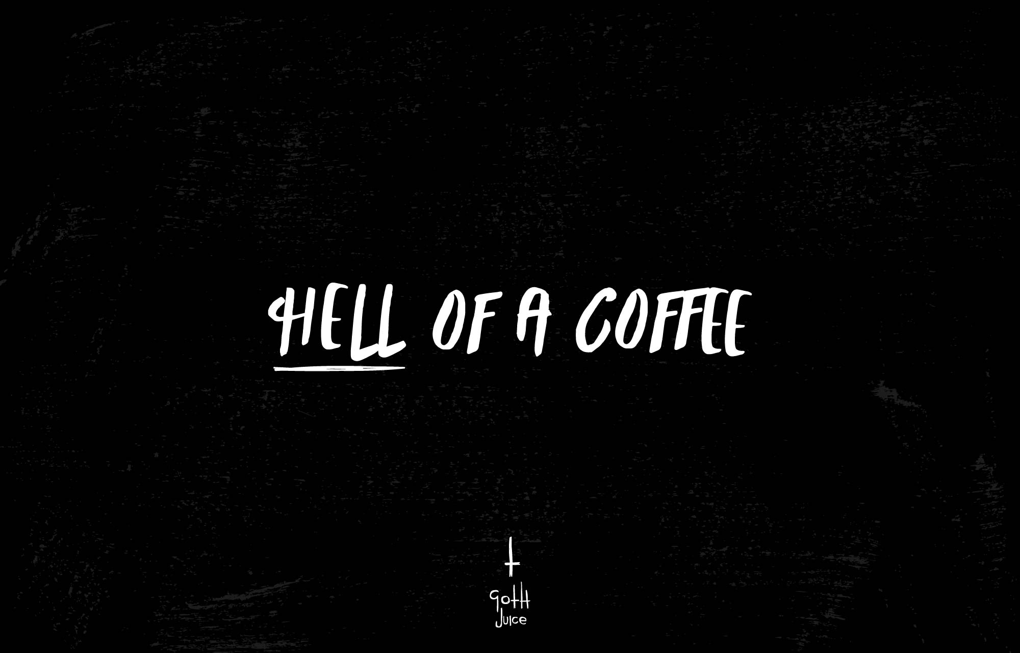
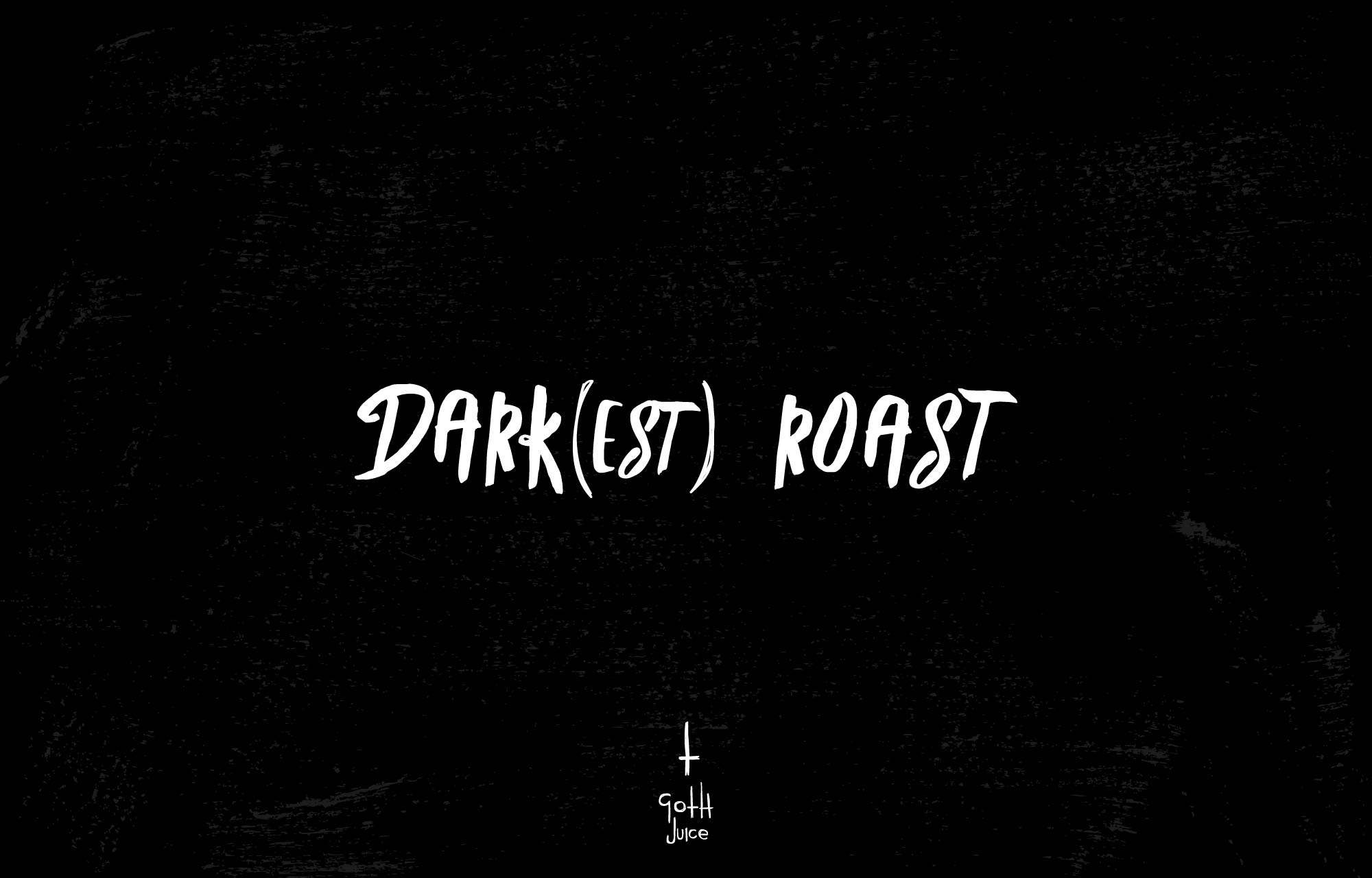
I had a few favourites which I thought worked well with mostly double meanings or goth related elements.
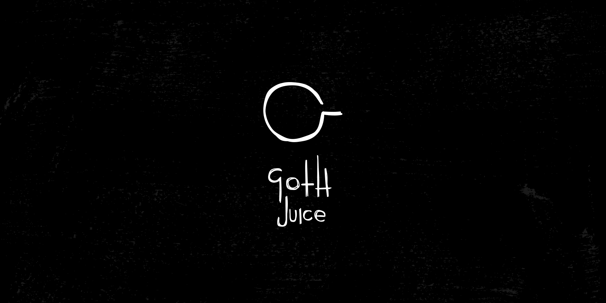
The more I played with icons for the brand, the more I could see them being animated for various motion graphic situations.
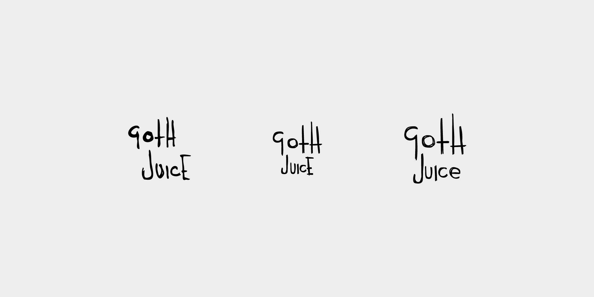
I created some more and found that working with the cup/G, the coffee swirl and the inverted cross I was 3/4 of the way to spelling GOTH, so I decided to add the H and look at a suite of these small pictograms which could form the basis of an animated identity.
While doing this, I redrew and tweaked the type just to tighten up a few bits. changing the capital E, redrawing some forms and moving the crossbar of the H down so that at smaller sizes it didn’t conflict with the t crossbar.
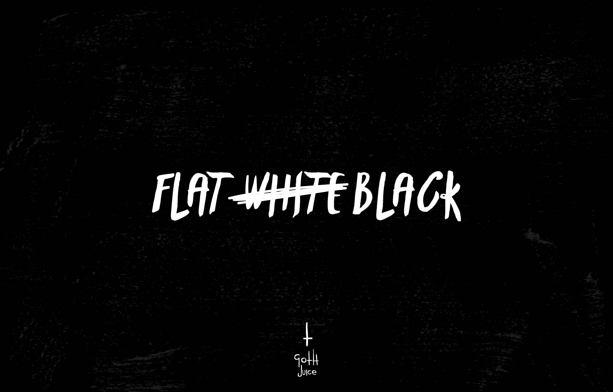
So at this point I was reasonably happy with the logo. I think the hand-drawn, scratchy nature played into organic forms, horror themes, and felt like it could easily be something scratched into a wall!
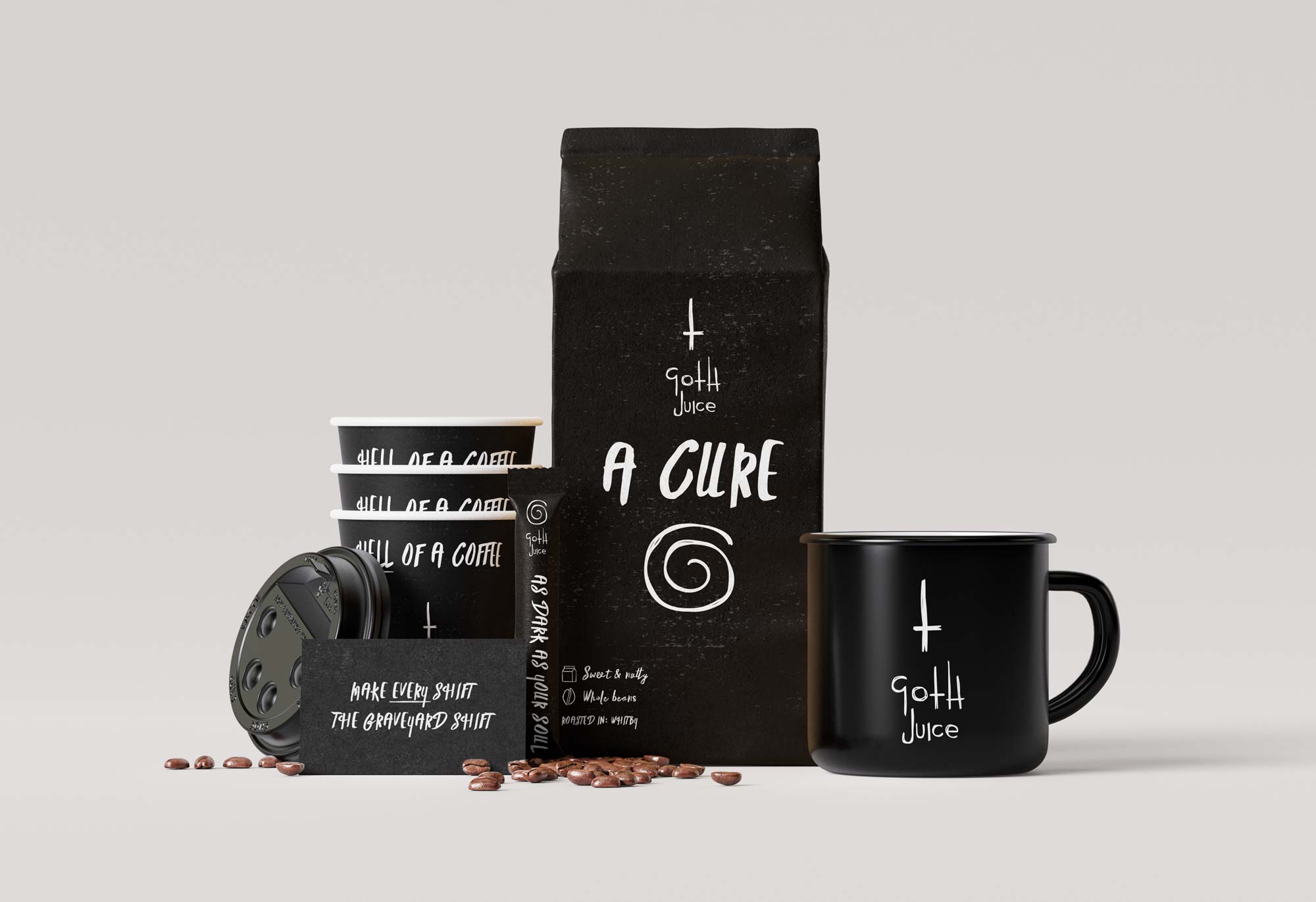
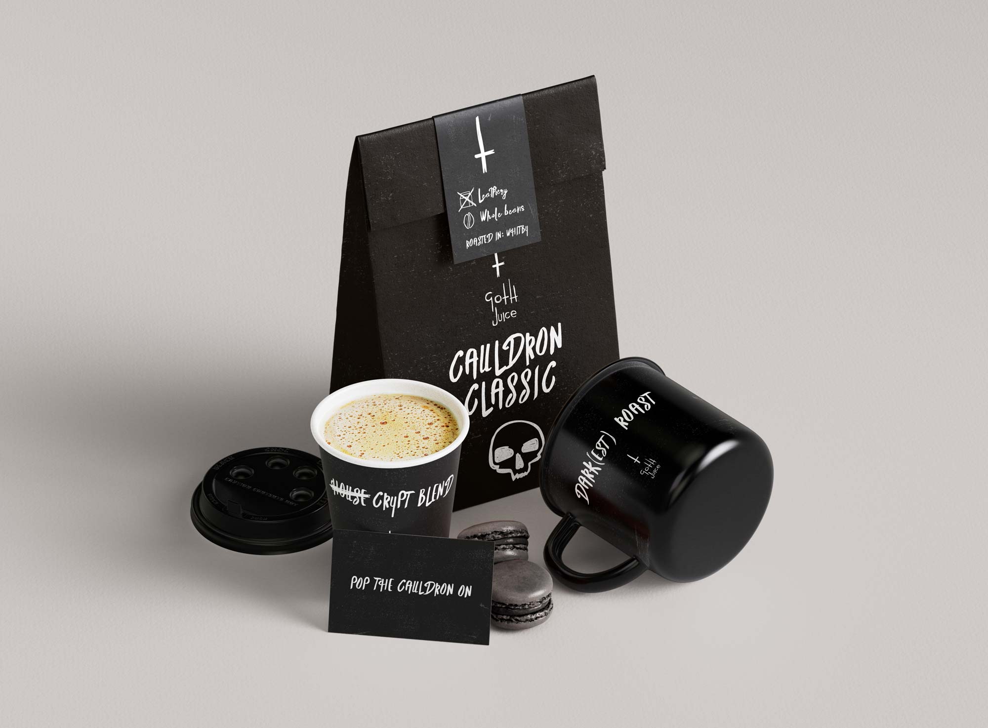
Next step was to look at working up potential packaging designs and brand collateral.
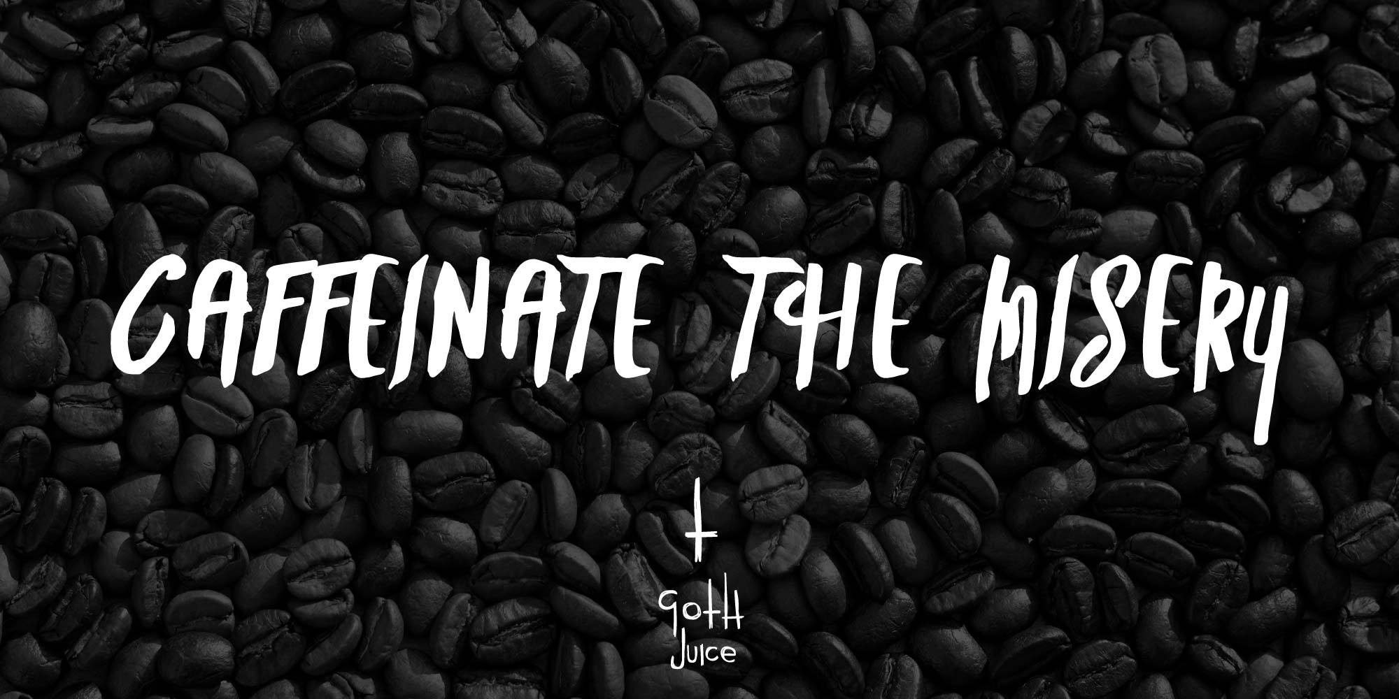
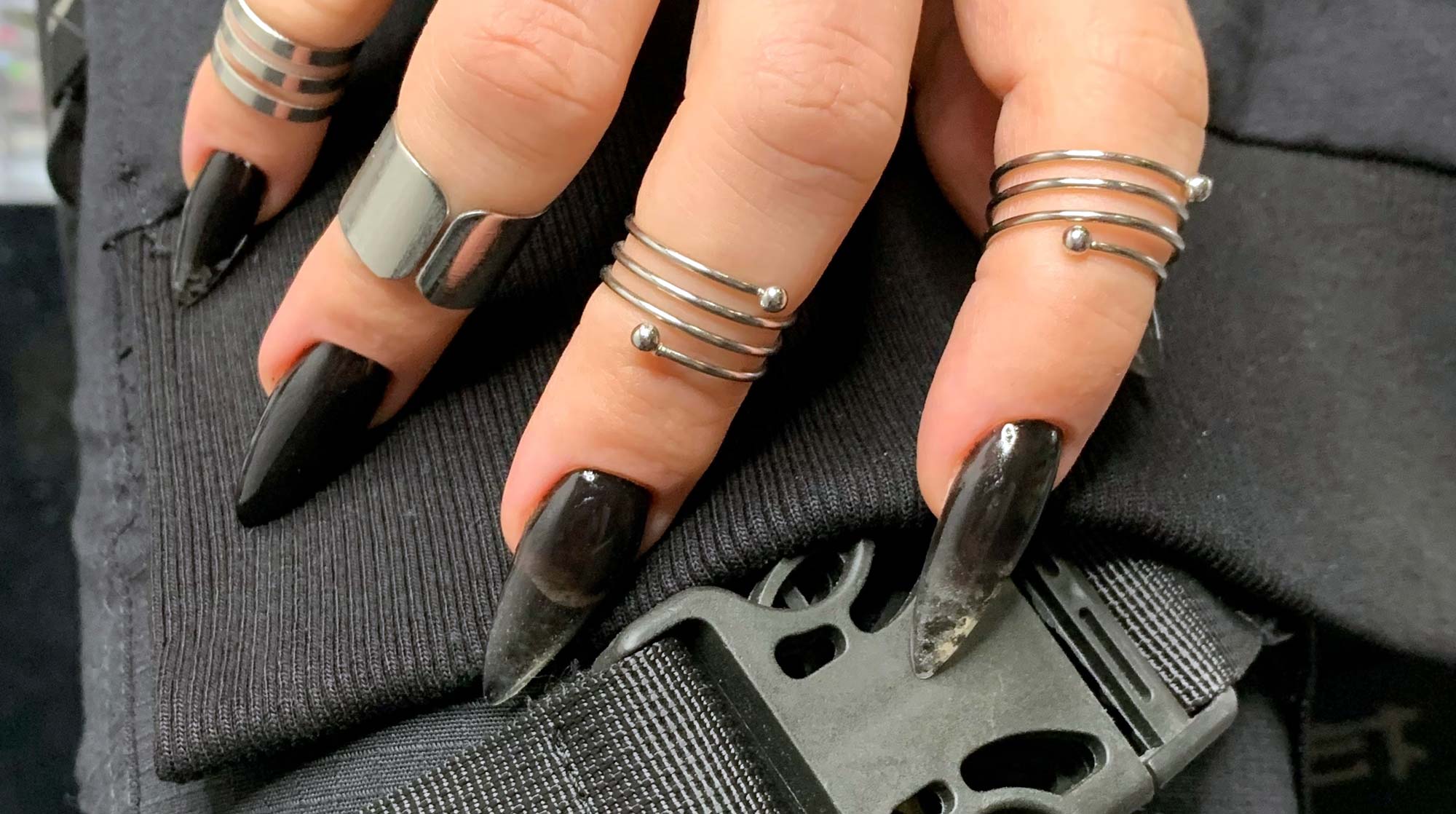
If we consider a goth’s brand identity, really there’s just one colour to consider. No guesses what that is.

The monochrome palette felt like it would be a nice zag from all the colourful branding illustrations elsewhere in the market.